JAS Digital Comm, also known as Just A Second, is a modern digital communications brand built on precision, speed, and clarity. Operating in a fast paced digital environment, JAS positions itself as a sharp, responsive, and detail driven communications partner that understands the importance of timing, accuracy, and visual discipline in today’s media landscape.
From the very beginning, our collaboration with JAS was envisioned as a brand identity project with attitude. The objective was not simply to design a logo or select colors, but to build a distinctive visual system that reflects the brand’s name, philosophy, and operational mindset. Just a second is not a casual phrase. It implies timing, coordination, and moments where communication either succeeds or fails. This idea became the conceptual backbone of the entire identity.
Brand Concept and Visual Direction
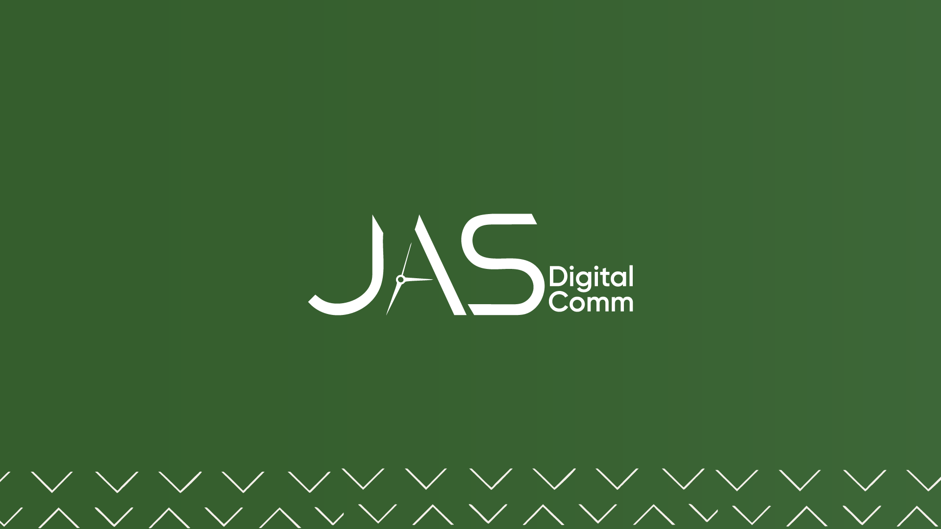
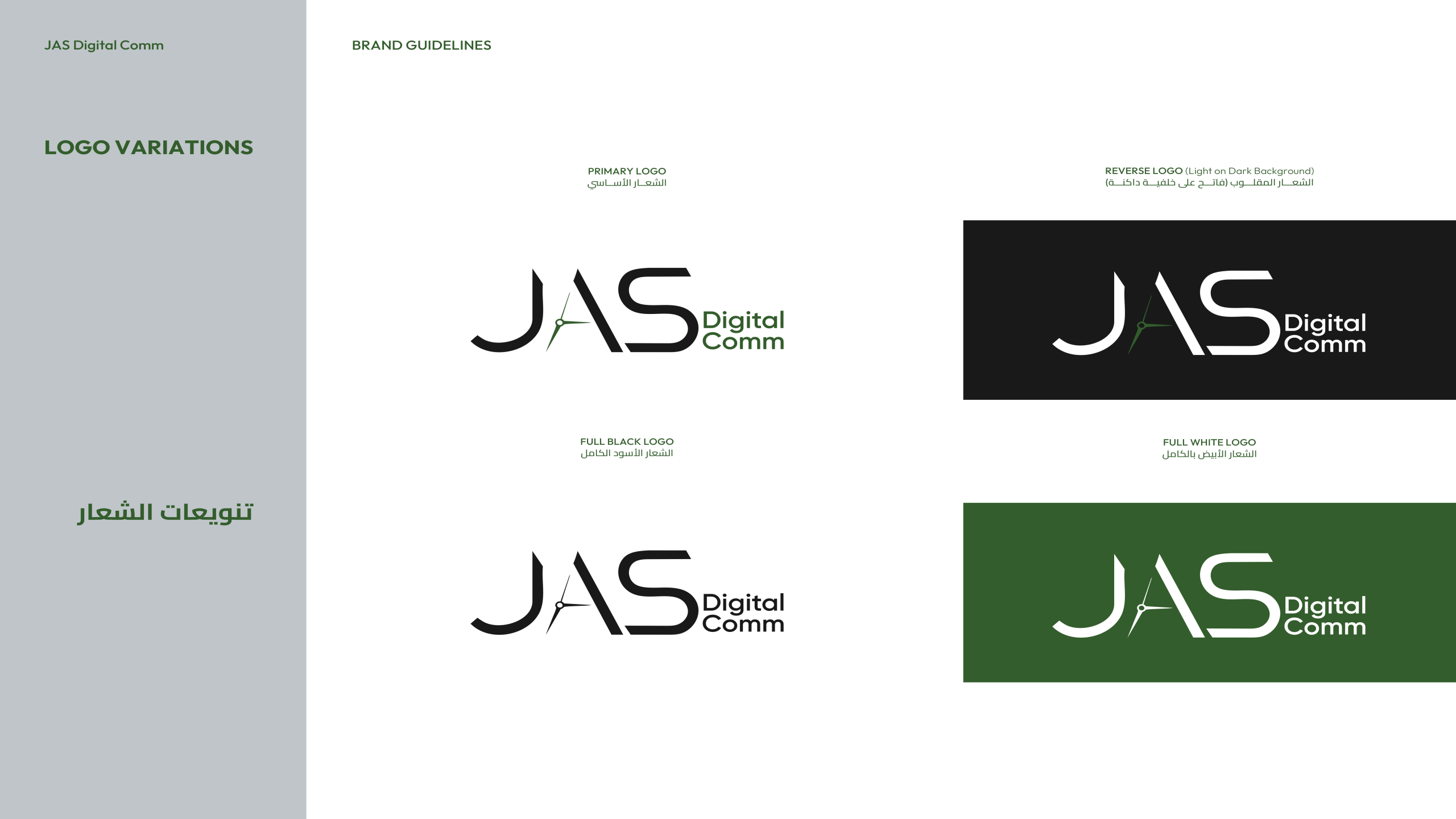
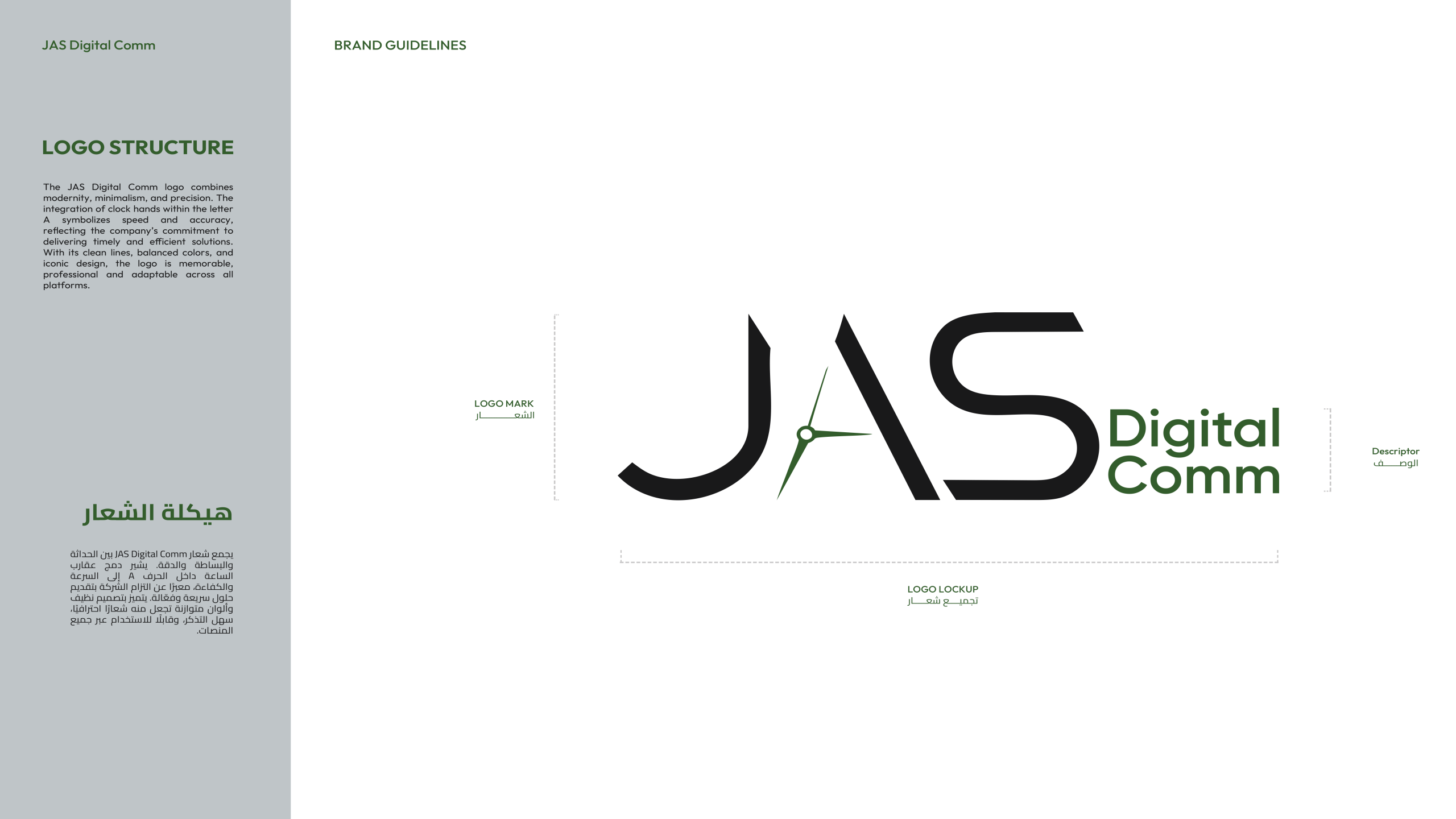
The visual identity for JAS was developed around the concept of precision in motion. The brand needed to feel fast, intentional, and controlled, without appearing aggressive or chaotic. We translated this concept into a visual language that balances sharp geometry with calculated spacing, creating a sense of movement that always remains disciplined.
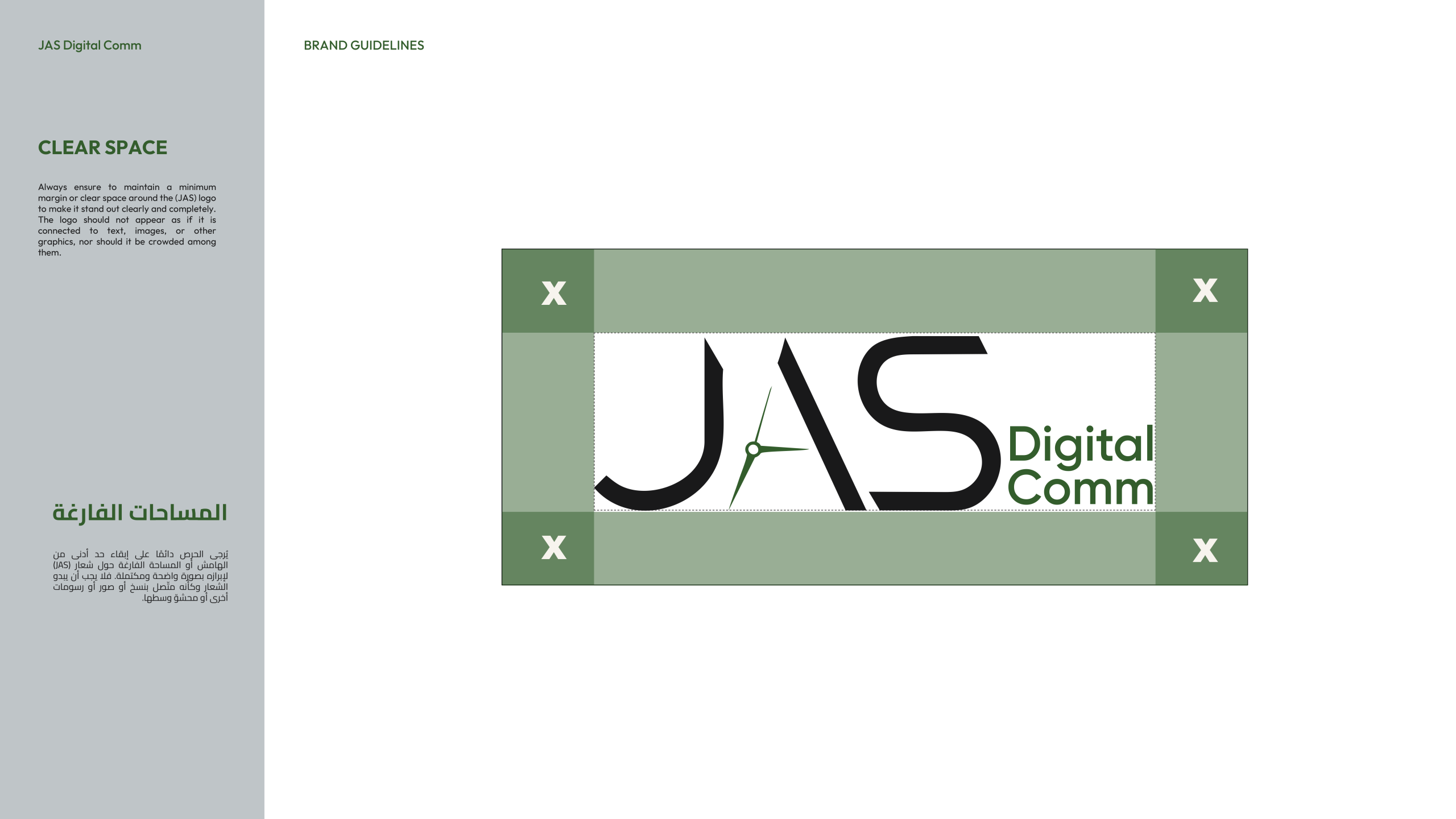
The logo design reflects this philosophy through clean lines and subtle angular references that suggest direction and timing. The identity does not rely on decorative excess. Instead, it communicates confidence through restraint, allowing the brand to feel modern, intelligent, and technically grounded.
Typography System
Typography played a critical role in shaping the JAS identity. We selected a dual type system that supports both clarity and flexibility across digital and print applications. The primary Latin typeface provides a contemporary, clean structure suitable for digital communication, while the Arabic typeface ensures linguistic balance and cultural alignment.
This typographic pairing allows JAS to communicate seamlessly across bilingual platforms while maintaining a unified visual tone. The system was designed to be highly readable, adaptable, and consistent across all brand touchpoints, from digital content to corporate materials.
Color Palette and Visual Balance
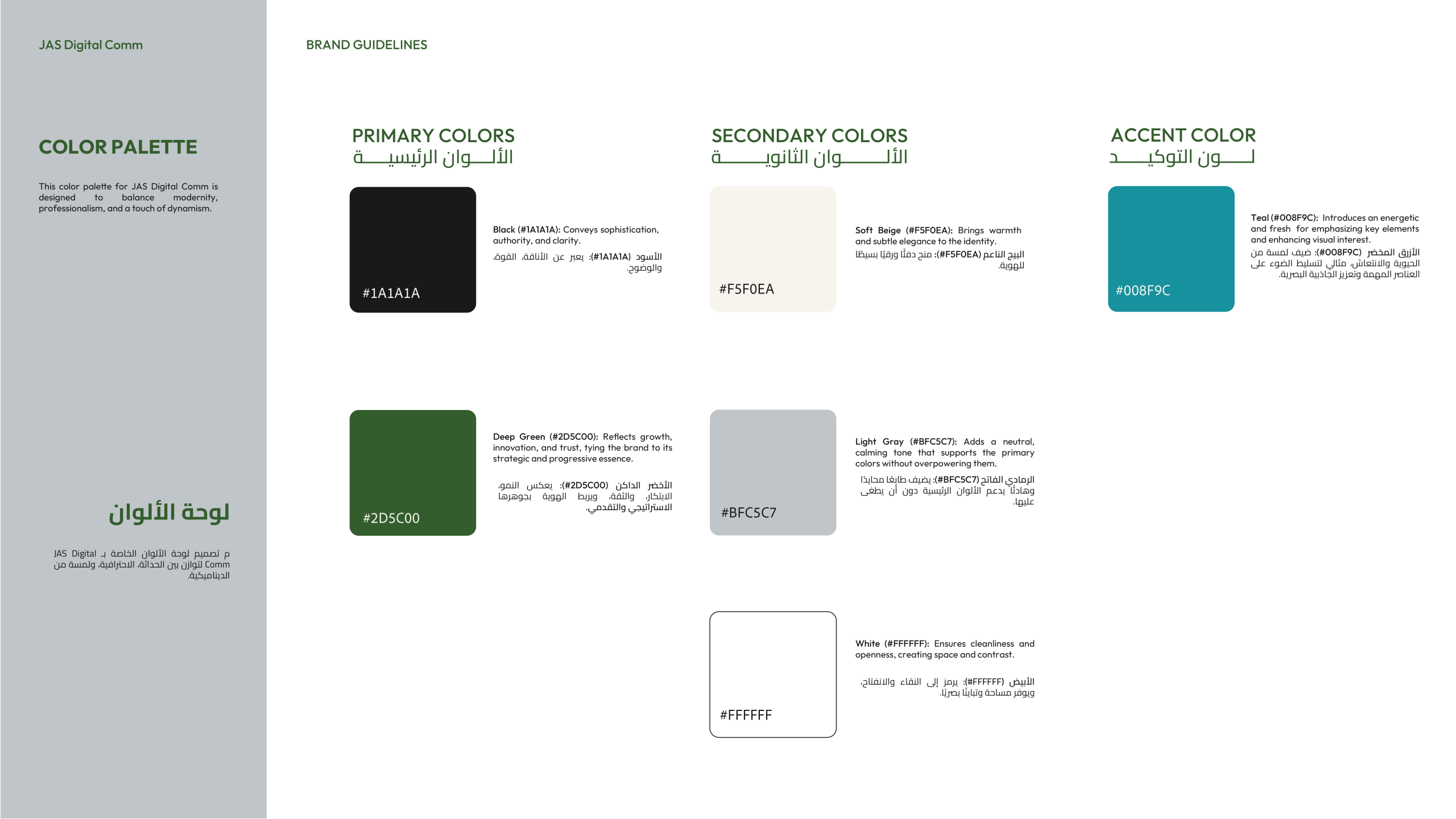
The color system was carefully curated to reflect professionalism, trust, and modernity. Deep, grounded tones establish seriousness and credibility, while lighter neutral shades provide balance and breathing space. An accent color was introduced strategically to inject energy and highlight key elements without overpowering the brand.
This palette allows JAS to shift between bold presence and understated elegance depending on context. Whether used in digital communications, presentations, or branded materials, the color system maintains visual coherence and strong brand recognition.
Pattern Design and Brand Motif
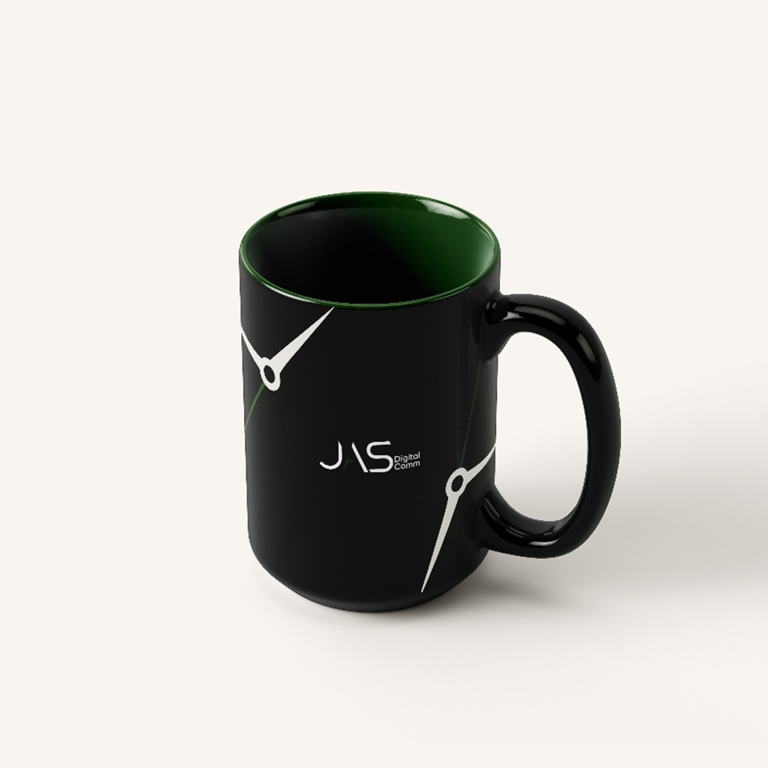
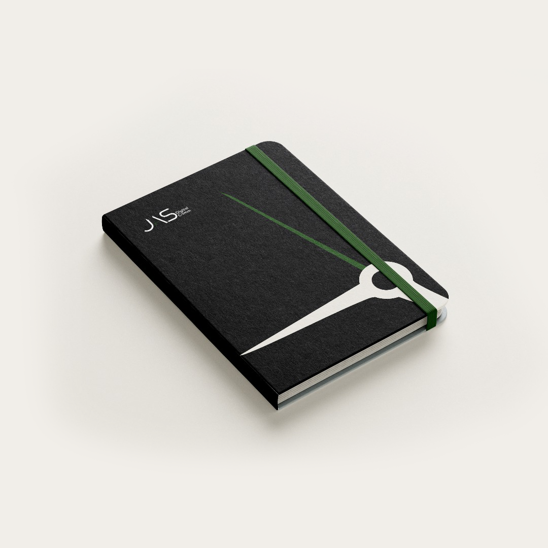
One of the defining elements of the JAS identity is its custom brand motif. Inspired by timing mechanisms and directional indicators, the motif reflects the brand’s name and core idea in an abstract yet recognizable way. The pattern suggests connection, synchronization, and continuous motion, reinforcing the concept of communication happening at exactly the right moment.
This motif was designed to be modular and scalable, allowing it to function as a background texture, a focal visual, or a subtle design element depending on application. It gives the brand a unique visual signature that can be instantly associated with JAS without relying solely on the logo.
Brand Applications and System Implementation
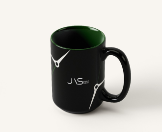
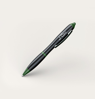
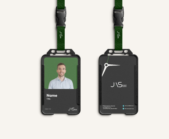
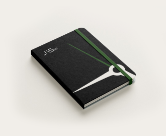
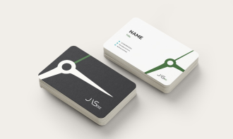
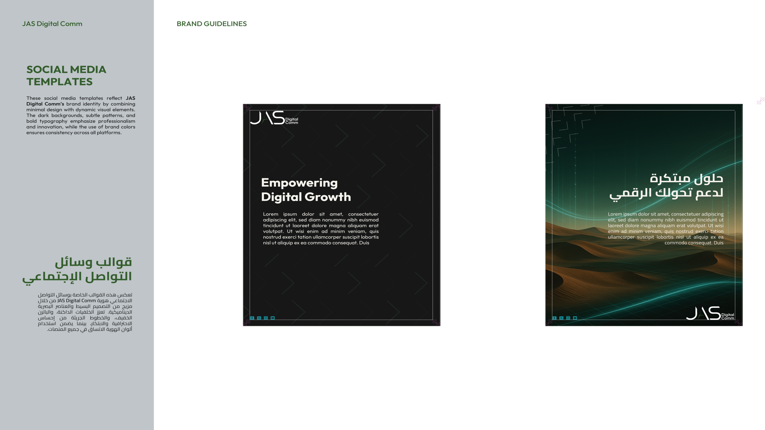
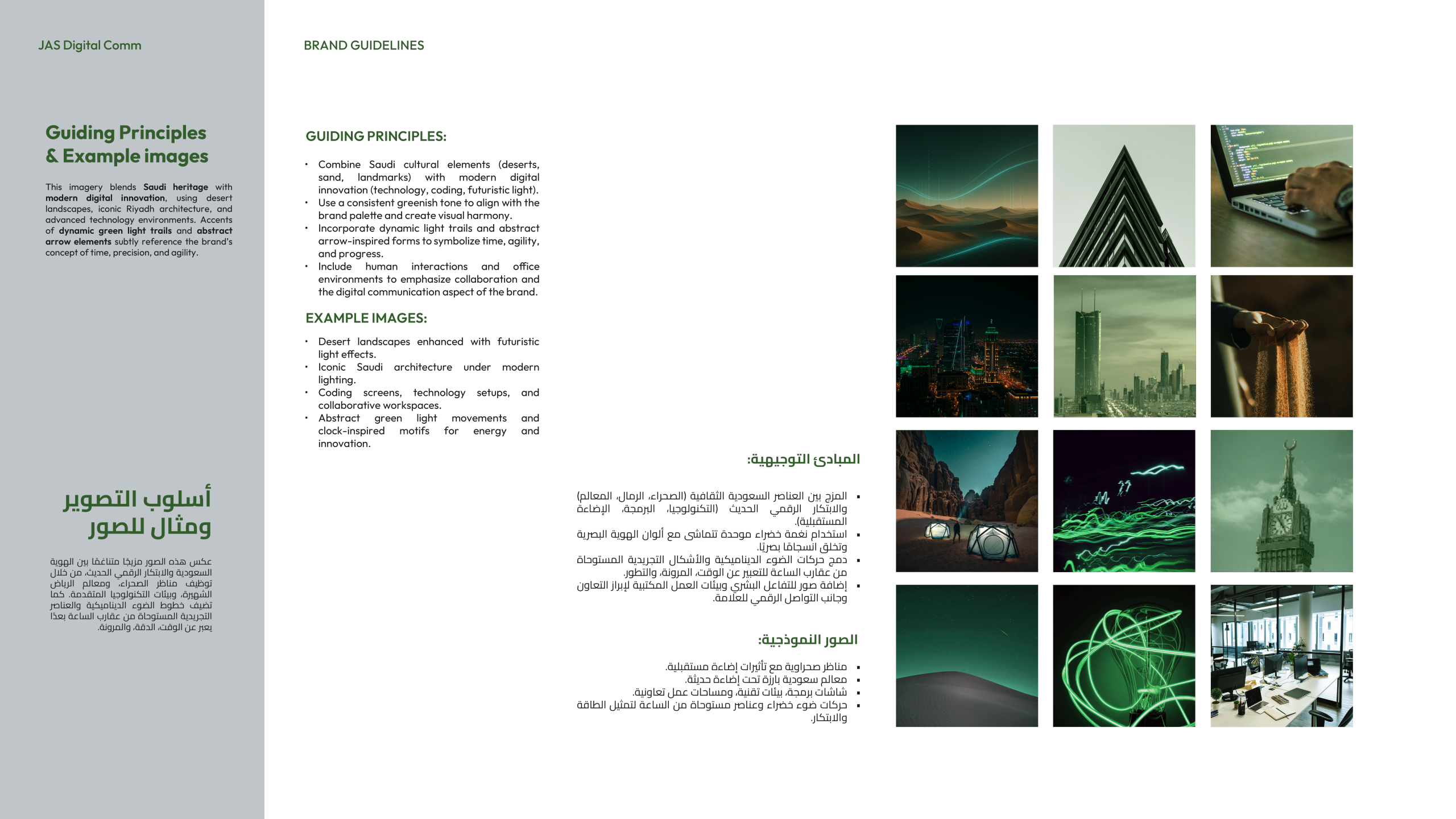
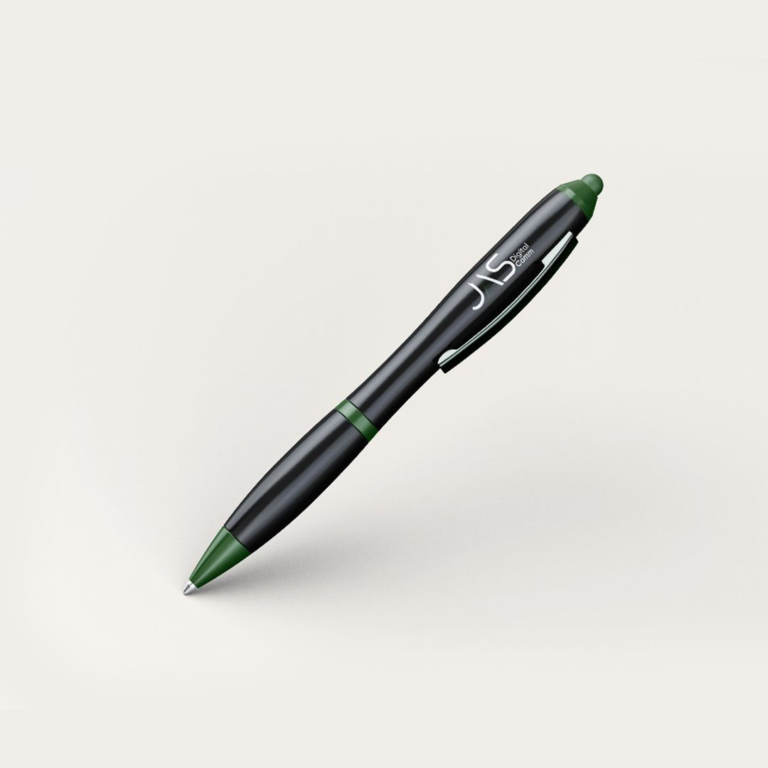
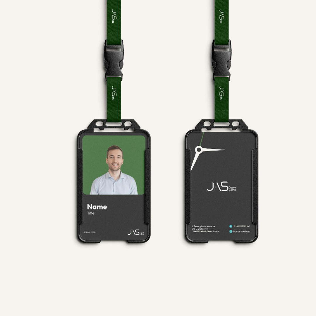
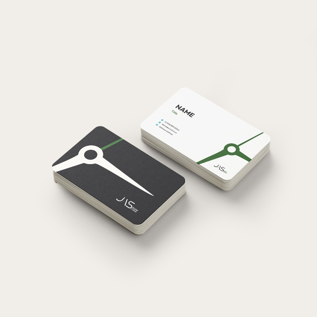
To ensure the identity performs beyond concept, we developed a comprehensive set of brand applications that translate the visual system into practical, real world use. These applications were designed to support JAS in its daily operations, client communication, and brand visibility.
From corporate stationery and digital templates to social media visuals and presentation layouts, every application follows the same visual logic and design discipline. This consistency ensures that the brand remains recognizable and coherent across all platforms, regardless of format or medium.
The application system was built with usability in mind, allowing the JAS team to adopt and maintain the identity easily without compromising quality or consistency.
Outcome and Brand Impact
The result of this project is a bold, confident, and highly distinctive brand identity that positions JAS Digital Comm as a modern communications entity with a strong visual voice. The identity reflects speed without chaos, precision without rigidity, and creativity without excess.
Through the development of the visual identity, typography, color system, brand motif, and applications, JAS now communicates with clarity and confidence across all channels. The brand system supports recognition, enhances credibility, and reinforces the company’s positioning in a competitive digital communications landscape.
This collaboration transformed JAS from a name into a visual language. A brand that does not just speak quickly, but speaks at exactly the right moment.